ILUMINAR PACKAGING
(2021 - 2024)
BOX DESIGN (2021)
With my aquiring of Iluminar, I set out to grow its reach through my branding. This new look was intended to capture attention through color, texture, and detail. This style fosters recognizability with the potential for brand evolution.
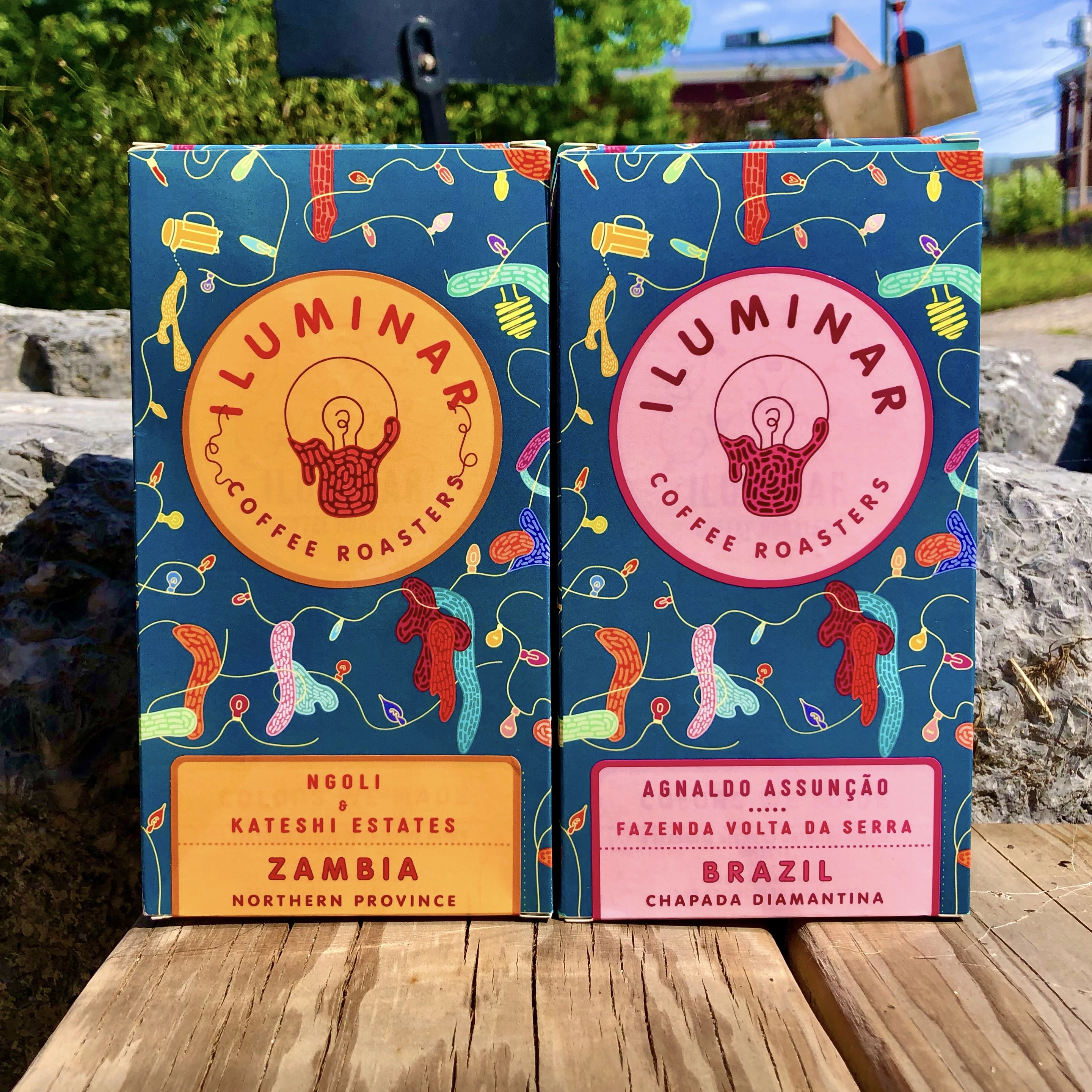
Packaging of Zambia (left) and Brazil (right) 2021
TAKEAWAYS OF THE BOX DESIGNS
1) Maintains uniqueness of box design and references to the lightbulb
2) Incoperates many colors to catch the eyes on the shelves
3) Diversity of color in the box design to allow for its multiple, cohesive variations
4) Intensive upfront design while less involved designing for differentiation
5) Unfavorable packaging cost and time efficiency
Offerings were differentiated by color schemes. The informational sticker (top) was bisectioned with geographic information on the front and coffee details on the bottom panel paired with with a circular iluminar logo on the front.
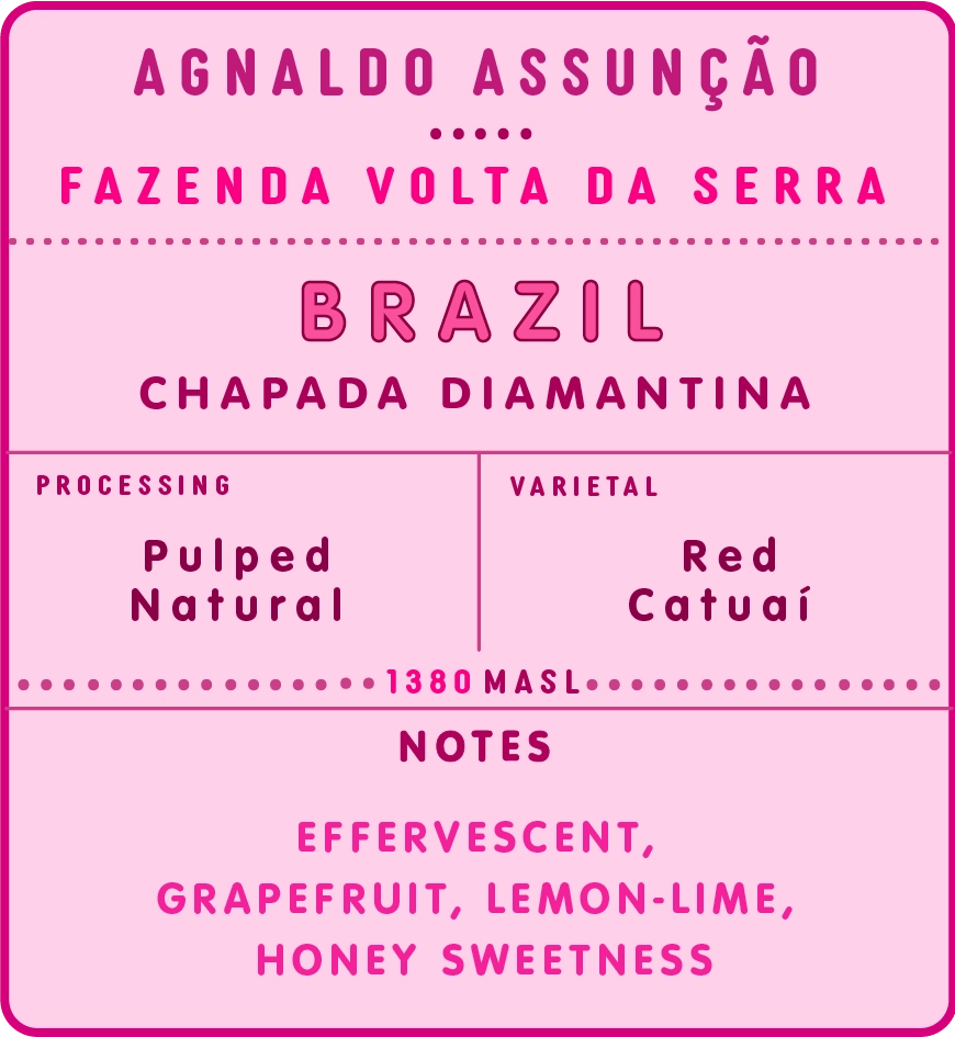
Ex. informational logo
Ex. front logo
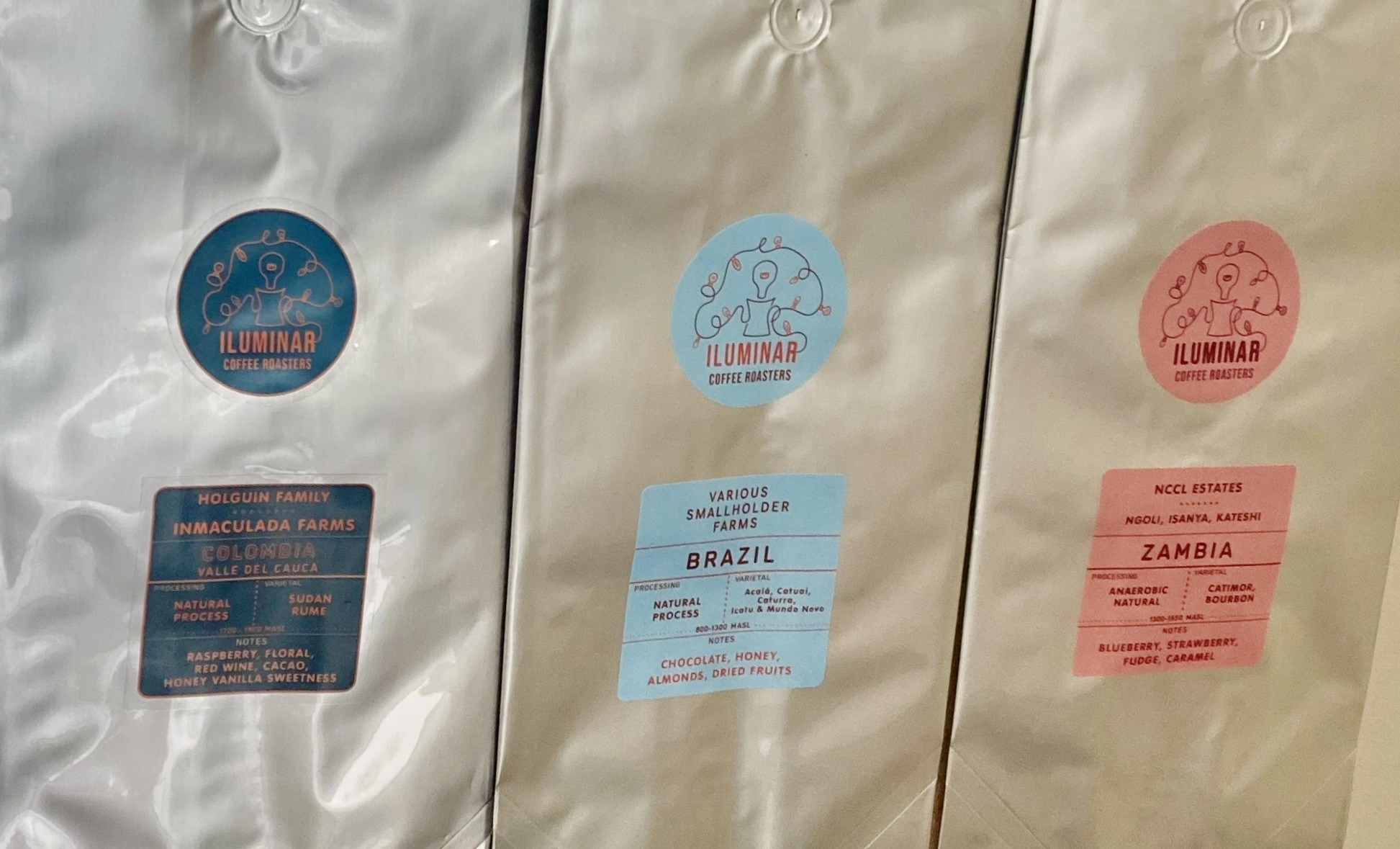
Ex. stickers purposed for bulk packaging
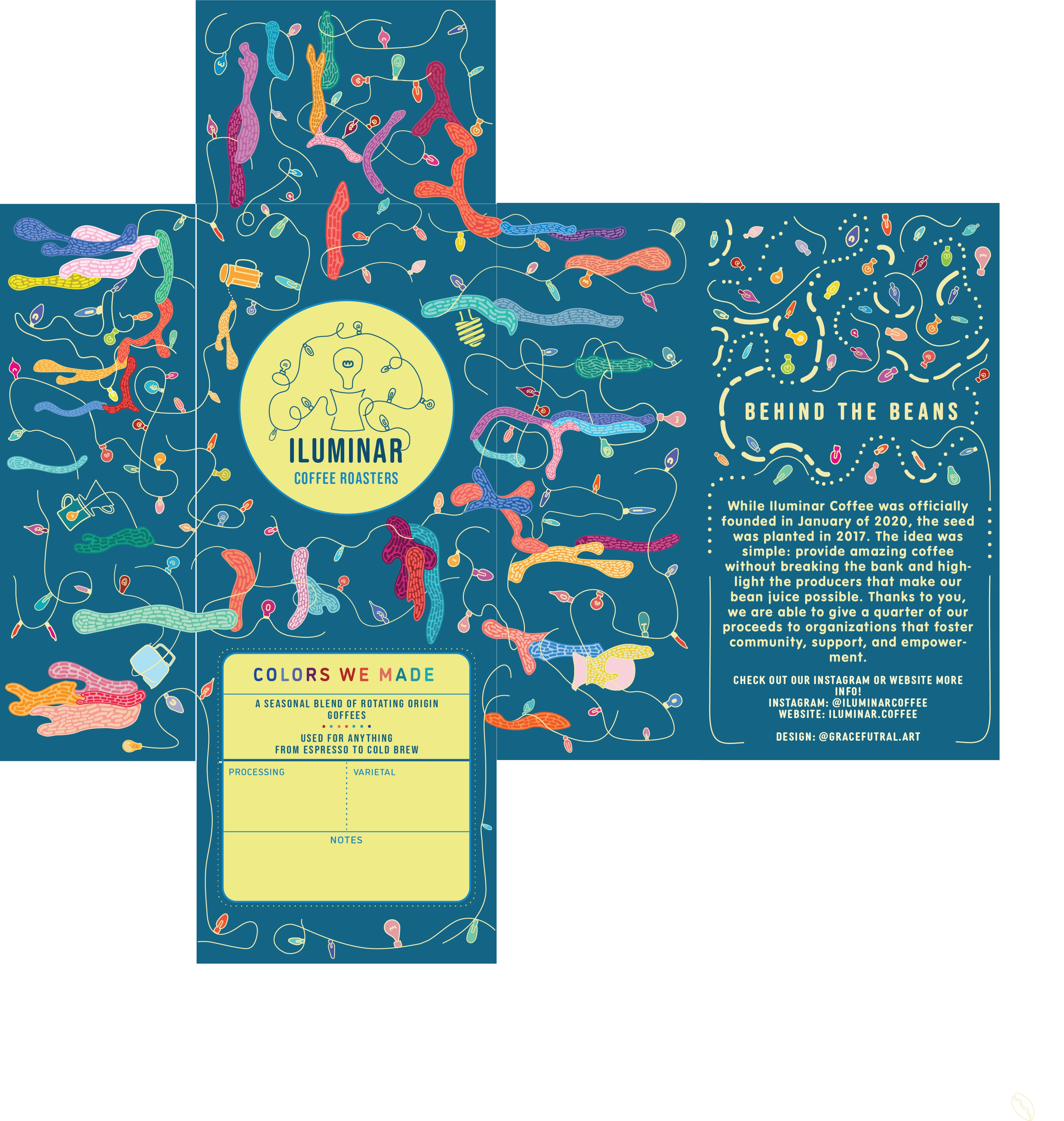
Layout of box design for printing.
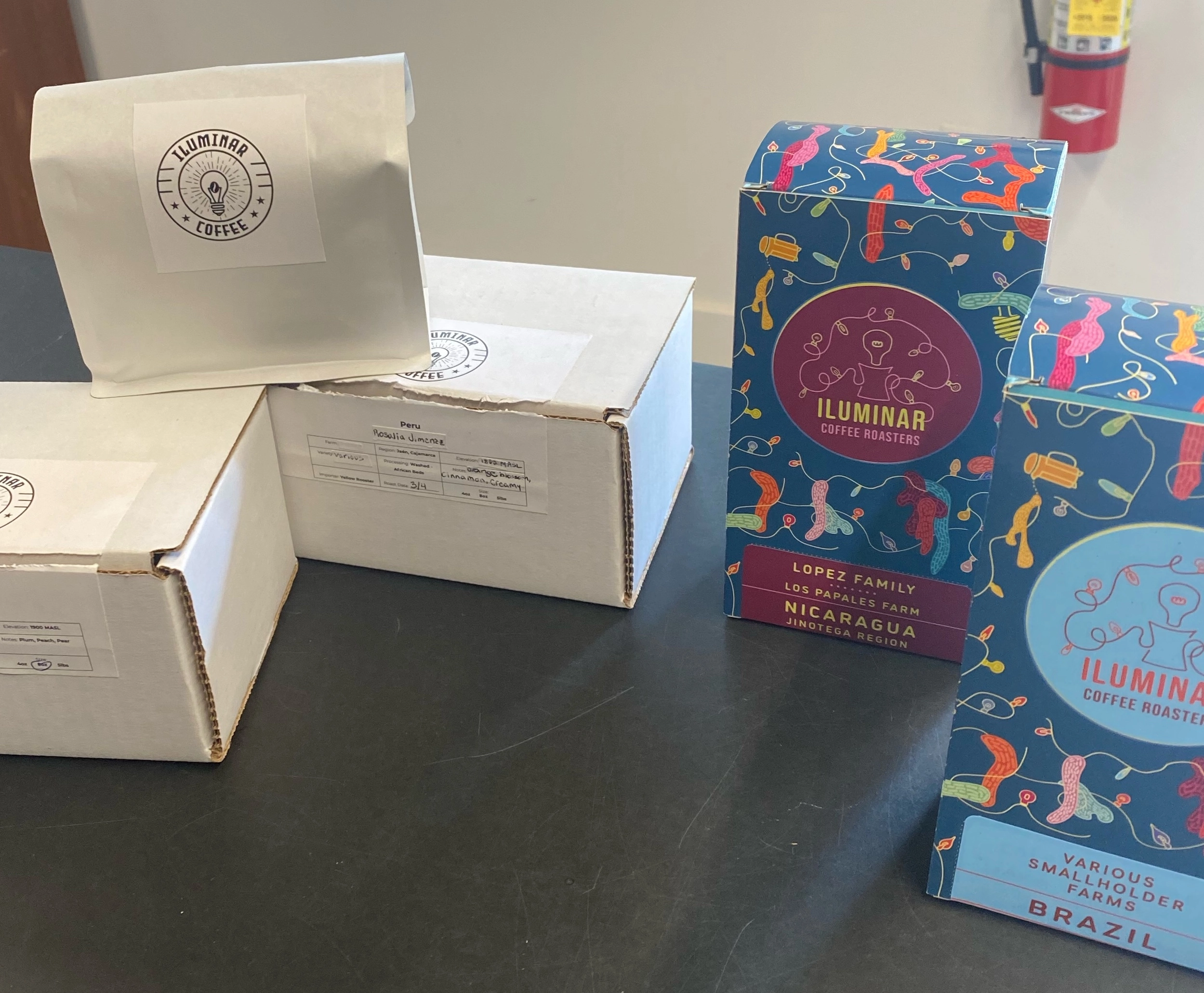
A side by side of the original (left) and newly branded packaging (right).
The box designs require building the box, packaging coffee in bags to be put inside box, and placing corresponding stickers.
BOX / BAG DESIGN (2022)
Snapshots of box/bag packaging line-up on shelves
TAKEAWAYS OF BOX / BAG DESIGNS
1) Maintains use of color for signature brand
2) Elaborates on unique box packaging
3) Introduces sloth as brand emblem
4) Intensifies differentiation through individualized yet syncronous designs
5) Uses carbon nuetral bag, following sustainability ethos
6) Includes more information in "blank" space, following transparency ethos
7) Reduces packaging cost
8) Increased travel derability
9) Increased design time
The layout was designed to target customer interation in mind, fostering a inclination to rotate and reveal each panel to cultivate each coffee's story.
Examples of panels using Guatemala 2022 packaging
Each band was composed of four panels: front panel (image 1) including individualized design and coffee origin, back panel (image 2) including additional information and contact details, and two side panels including roast/size (image 3) and coffee information (image 4).
Layout of 4 x 16 in cardstock designs
Prints were scored to match the dimensions of a coffee bag, fitting tightly when full and imitating the feel and appearance of a box.
POUCH BAG DESIGNS (2023)
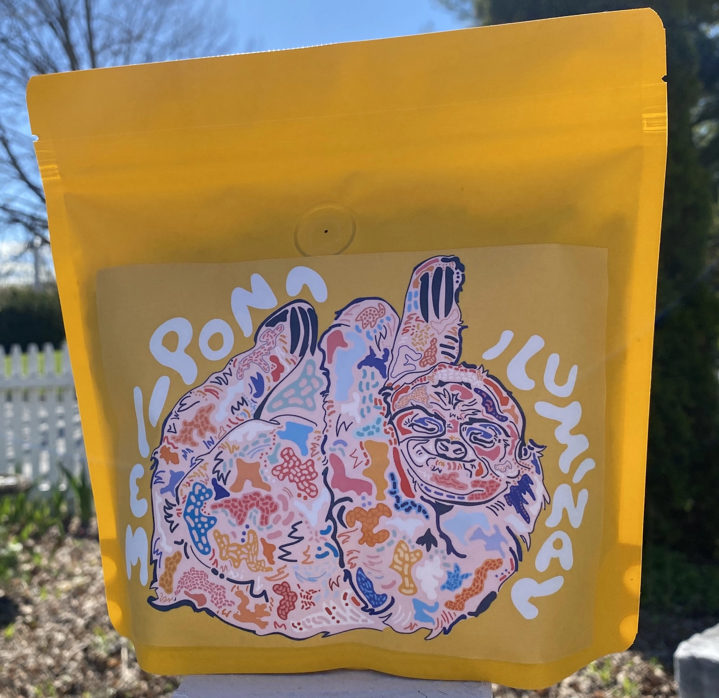
Snapshot of Melipona Blend (May 2023)
TAKEAWAYS OF YELLOW BAG DESIGNS
1) Maintains use of color and signature design subjects of brand
2) Includes more information, personalized guidance for customer experience
3) Maintains carbon nuetral packaging vessels
4) Intensifies differentiation through individualized designs
5) shifts element of synocrosy to elevate design demand
6) Includes "blank" space to highlight individual design illustrations
7) increases cost, design, and production efficiency
8) Shift towards in-house label printing
More blank space allowed the inclusion of a brew guide to enhance customer experience. Back labels also evolved to include qr code and area for the roast date (see highlighted area) of each bag to further demonstrate transperancy.
Three iterations of back labels in chrological order to be printed on 4x6 DYMO labels.
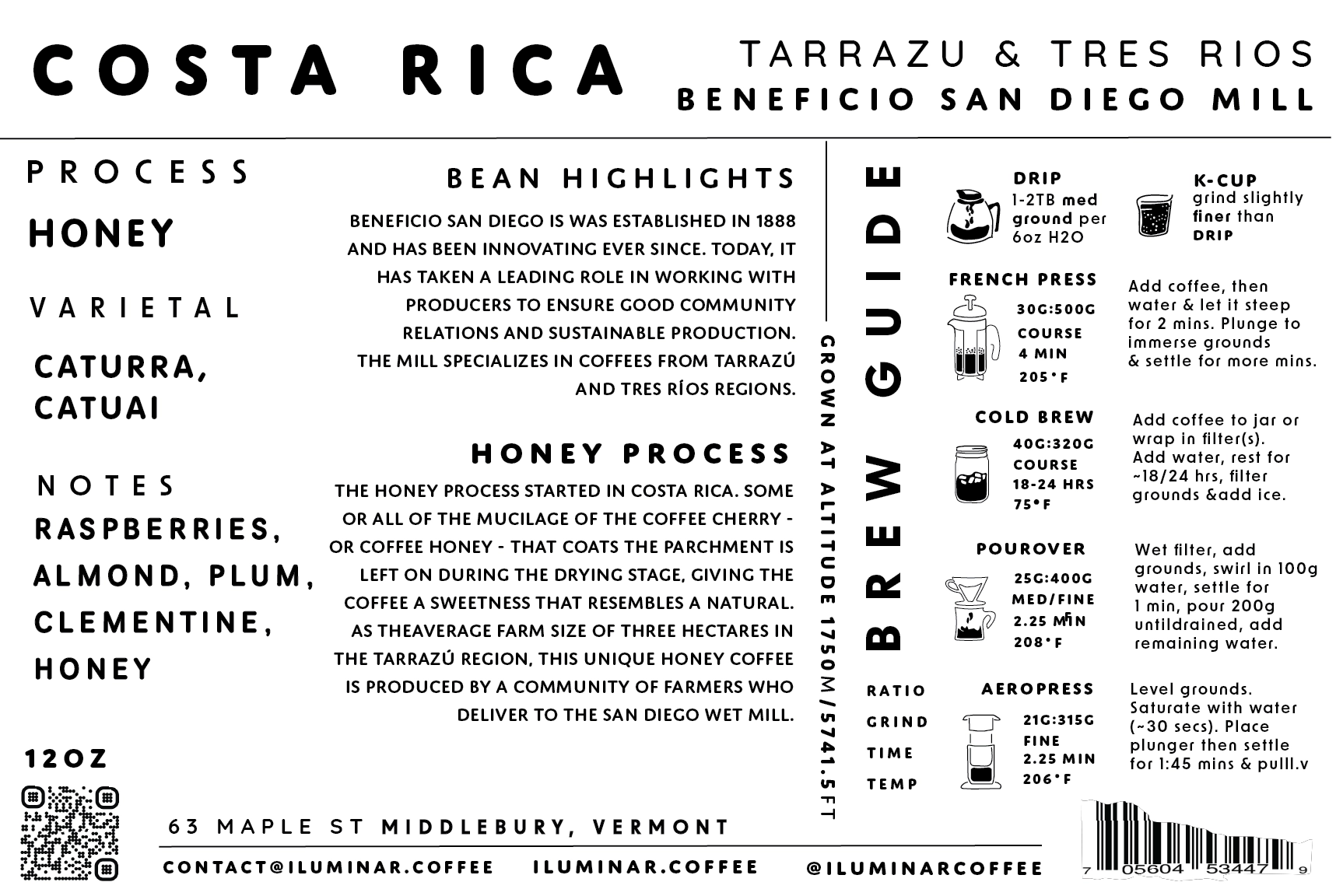
Ex. the last version of back labels for the 2023 release
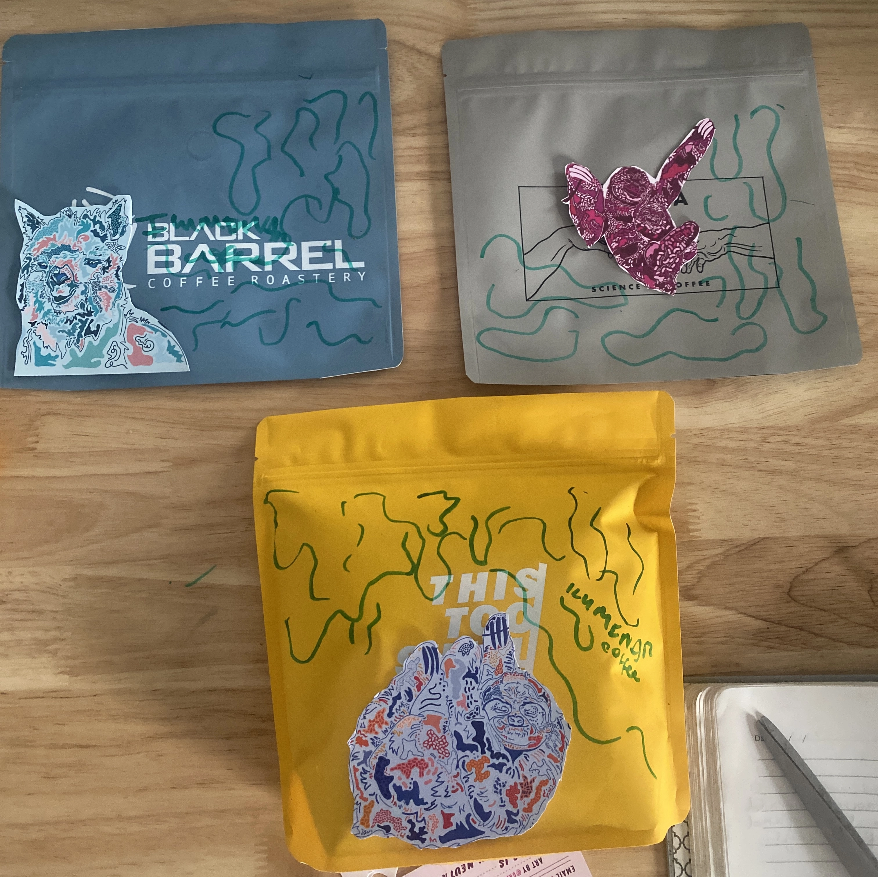
Brainstorm session with old labels and sample bags
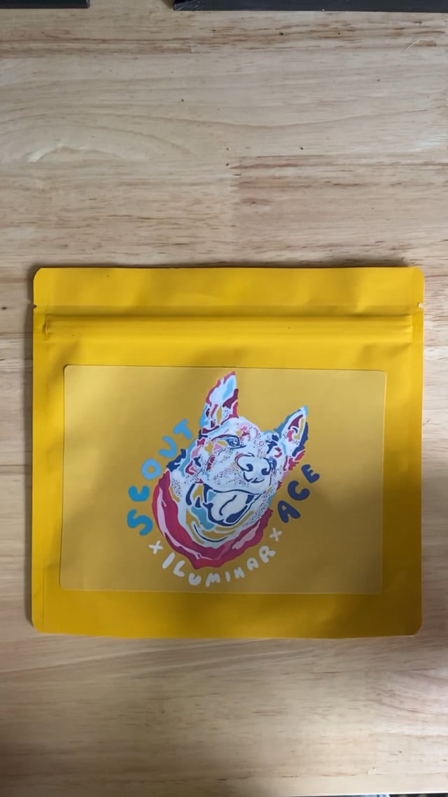
Packaging Ace Blend
Yellow bags met the standard set for stand-out packaging characteristic of Iluminar. The dramatic choice in color bolstered the remarkable quality of the labels. Evenmore, yellow, as a thematic color carried throughout most designs, creates the illusion of intensive design effort comparable to previous packing releases.
This version marks the introduction of the circle labels which fit seemlessly in negative space and echoed the evolution towards information-heavy packaging without sacrificing visual appeal.
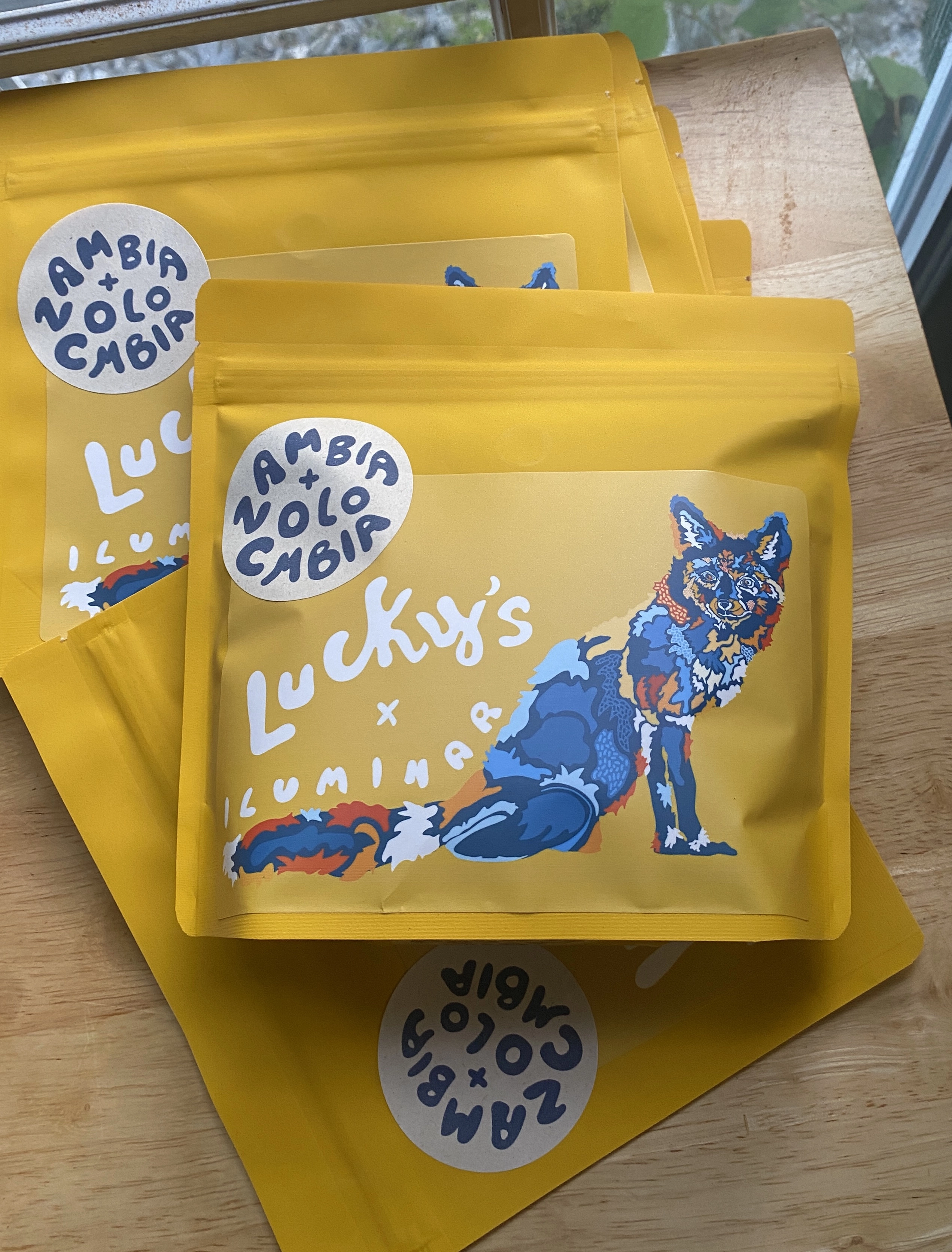
Luckys x Iluminar Blend with circle labels
PINK POUCH BAGS (CURRENT)
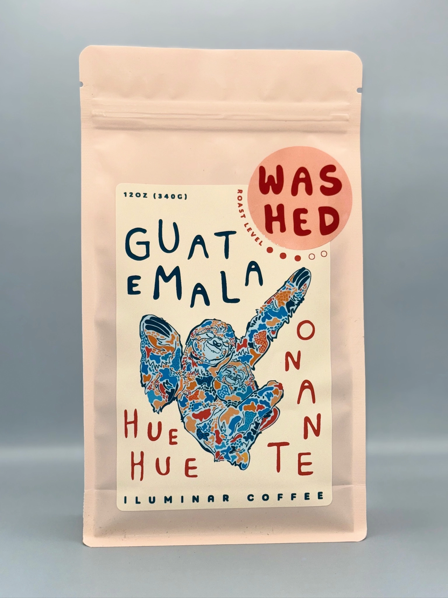
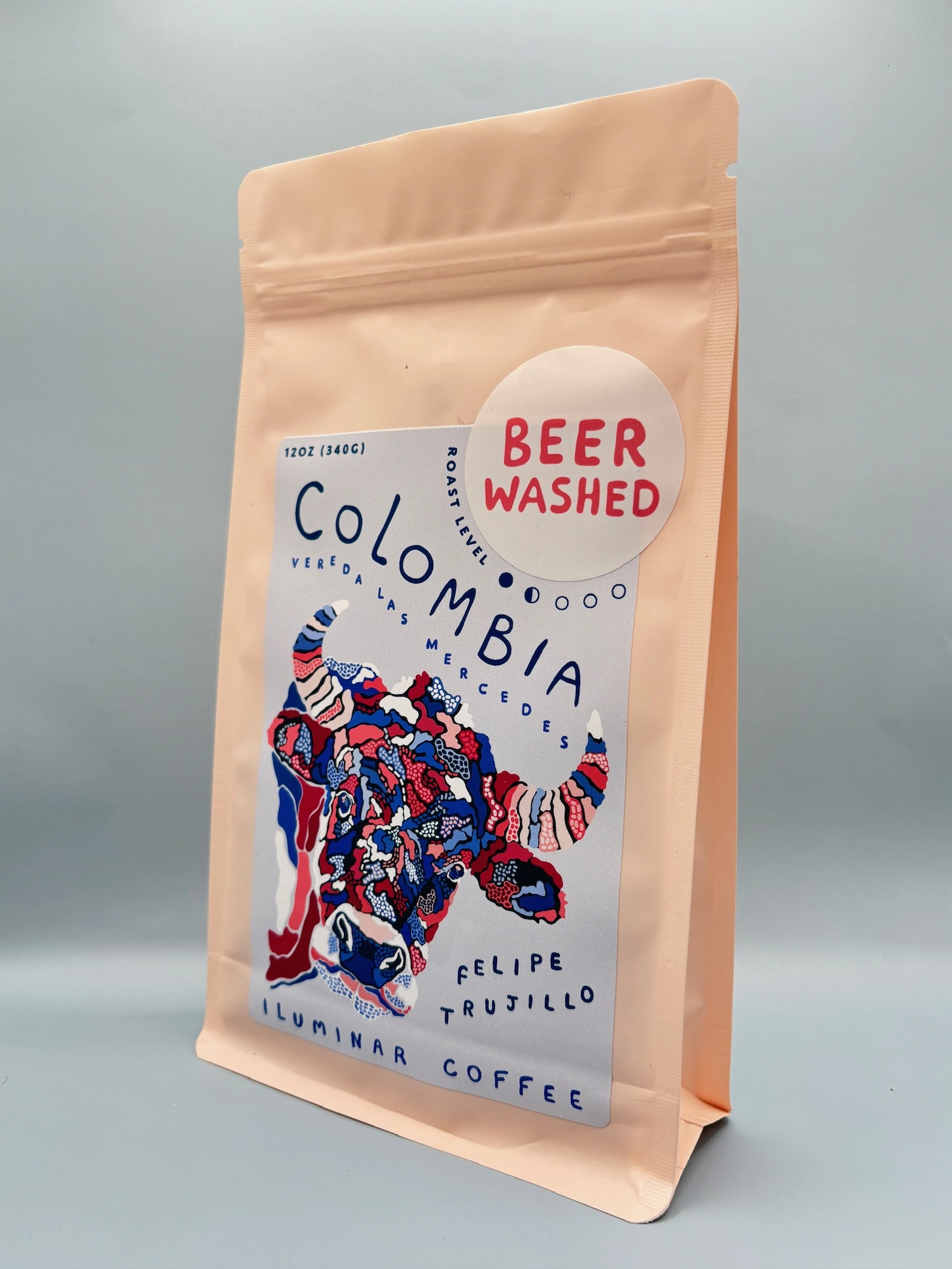
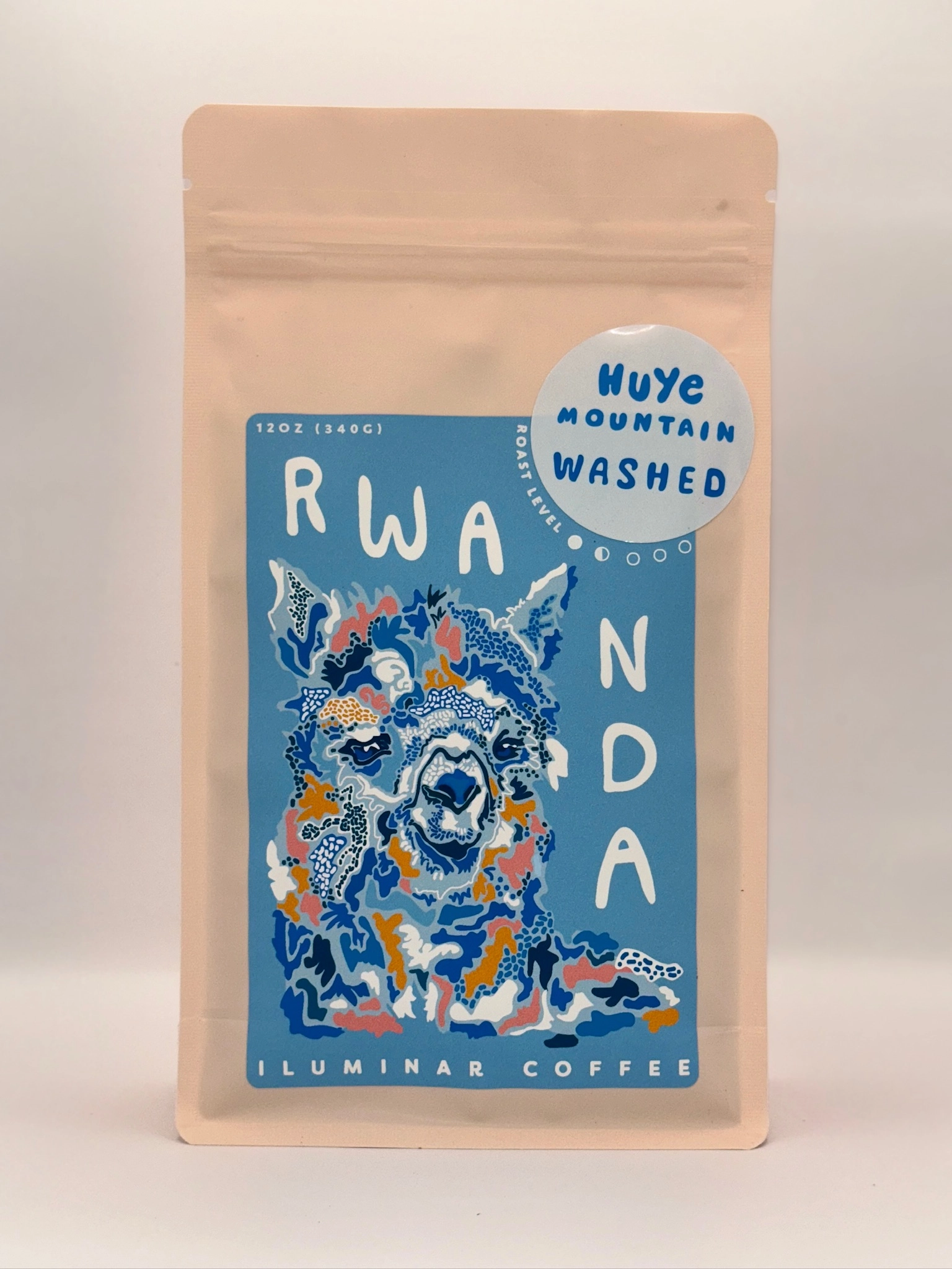
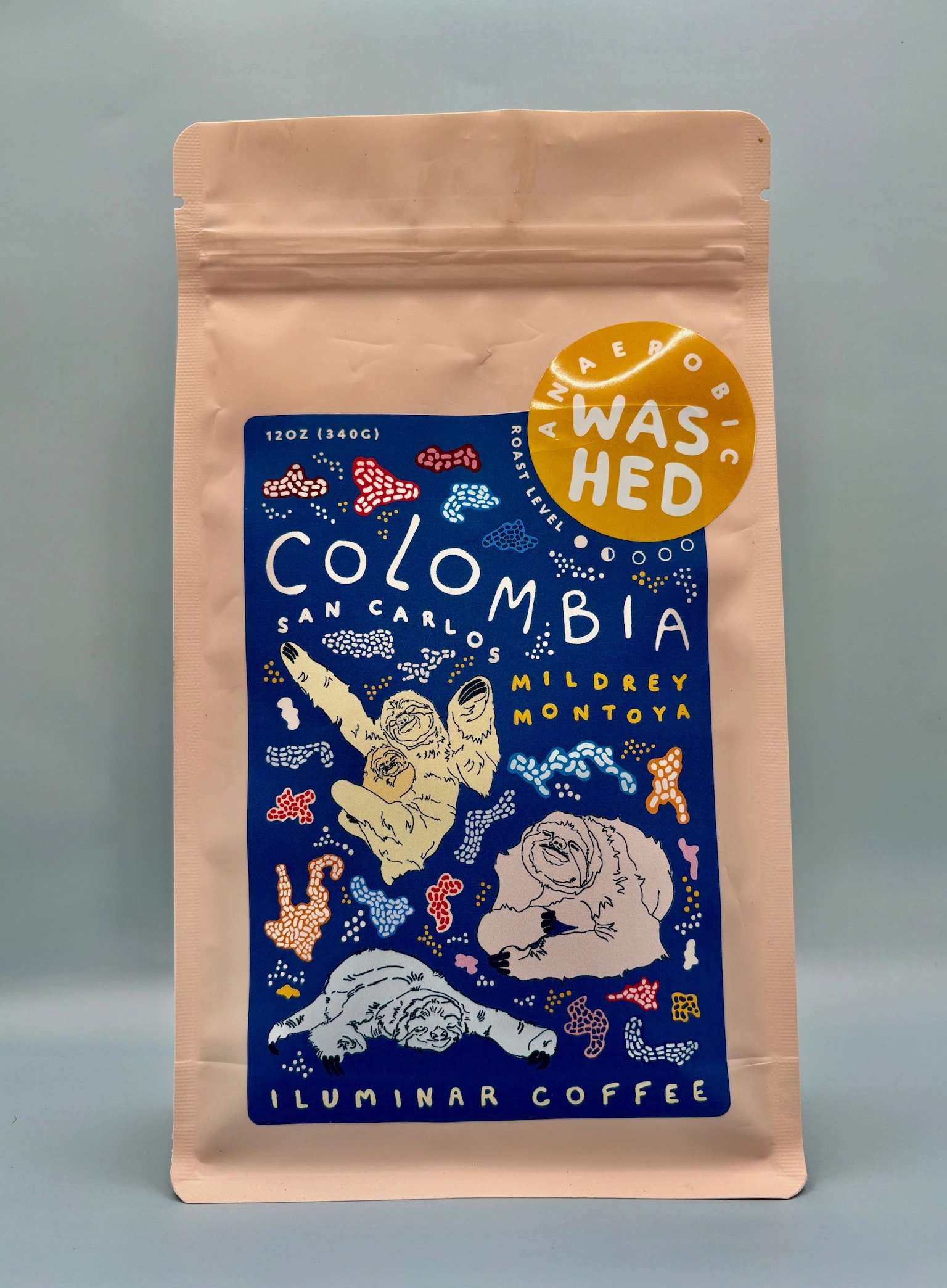
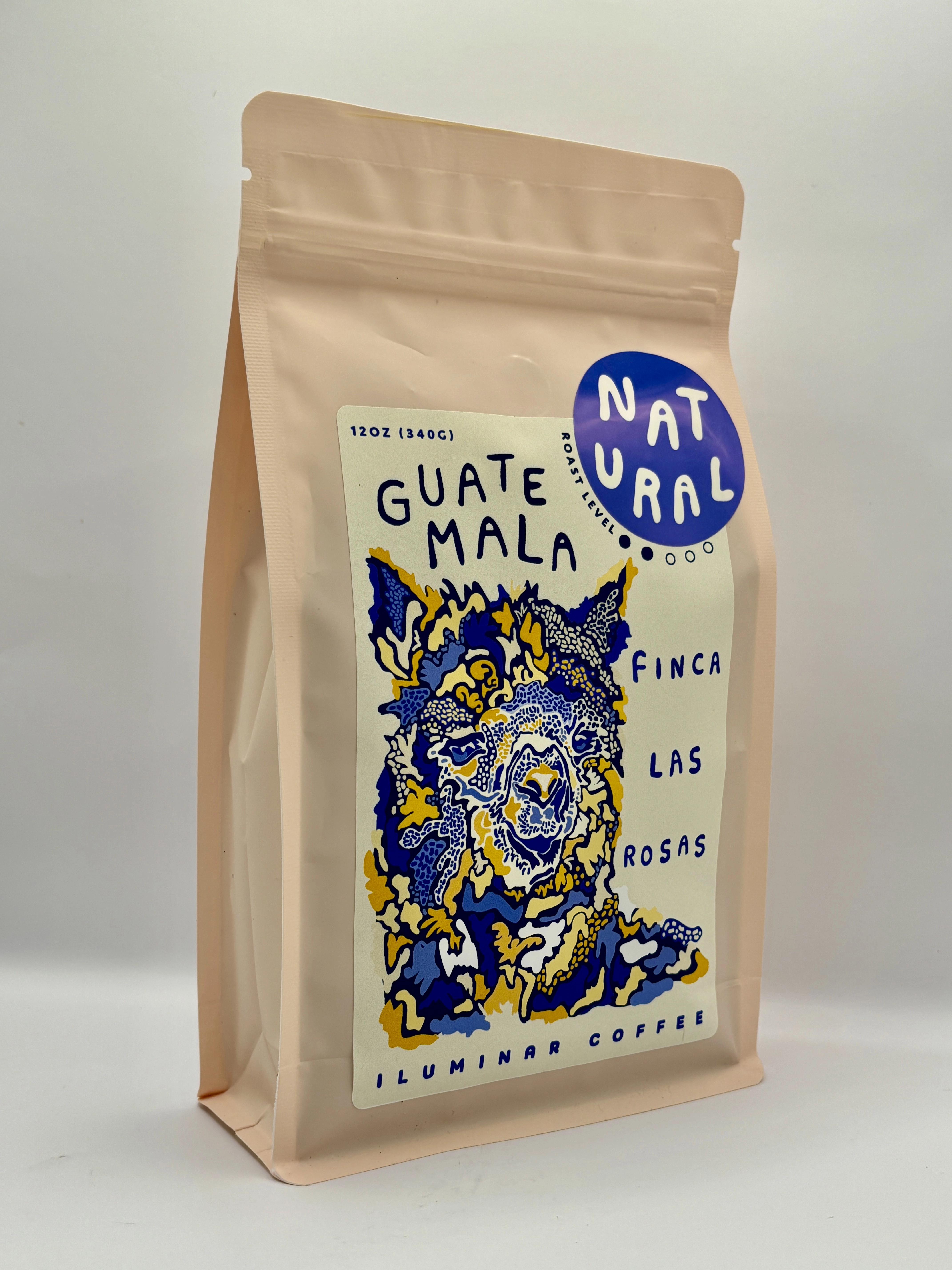
The current iteration optimizes the Iluminar brand, accumulated by the multiple demonstrations of its diverse yet recognizable style. All production was shifted to in-house printing.
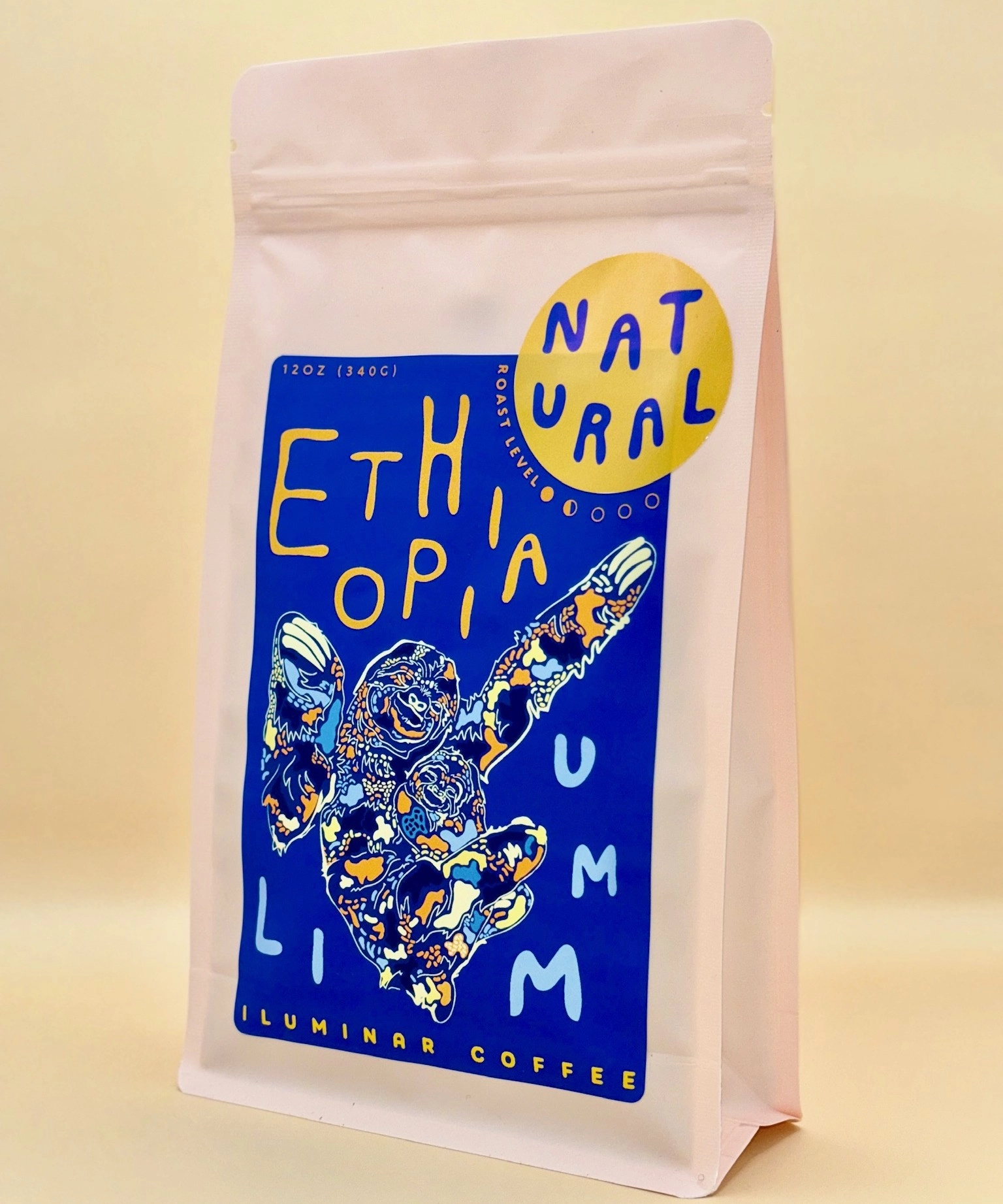
Ethiopia 12oz Bag
TAKEAWAYS OF PINK POUCH BAG DESIGNS
1) Demonstrates illustrative and colorful brand style, enchancing visual appeal
2) Optimizes information of coffee story, signifying brand ethos of transparency and playfulness
3) Maintains carbon nuetral packaging vessels
4) streamlines packaging operation, eliminating third party involvement
5) increases potentiality for wholesale customization and limited releases
6) increases travel/shipping derability
Line up of Ilumianr 2024 Release
Ex. Back label formatted for DYMO 4x6 labels
Back labels were reconfigured to maintain magnitude of information and enhance visual appeal.
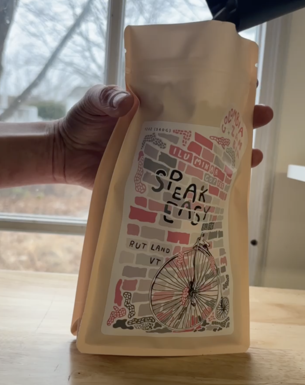
Label production and packaging of customized Speak Easy x Iluminar bag
With production shifting to in-house packaging improved quality, cost/time efficiency, and all-around representation of the Iluminar brand and what it stands for.


