FLORA PACKAGING 2022
Flora is the first recreational cannabis store in Vermont, opening on October 2022.
ASSIGNMENT
CREATE a design for 4oz & 6oz product boxes to pair with the existing, baseline emblem.
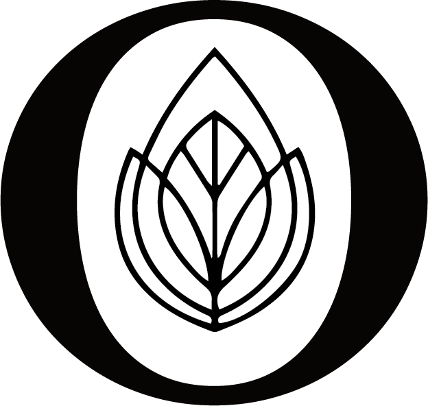

After consultation, the concept determined was a clean and illustrative design that subtly demonstrated themes of Vermont.
PERAMETERS
A substantial amount of information must be dedicated to text required for cannabis packaging.
The boxes would would be matte white with black emblem on the top panel and black logo on the front panel.
Evoke feelings associated with cannabis without being explicit.
MY PROCESS
Having previous experience with box design, what felt most impactful with such limited space was a continuous illustration across all panels.
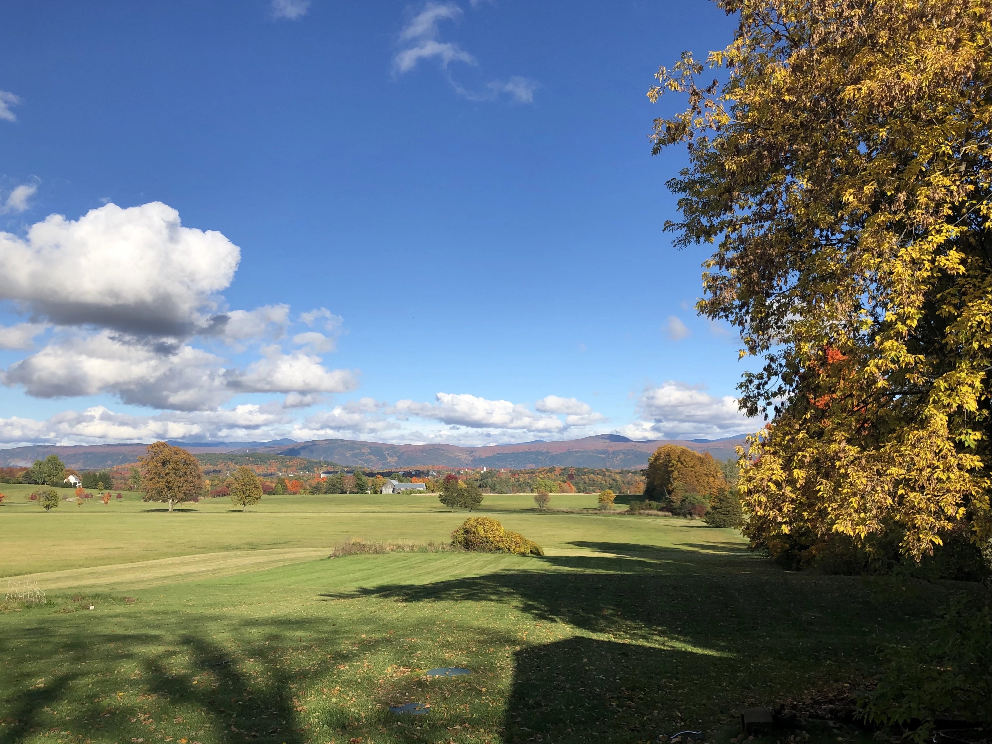
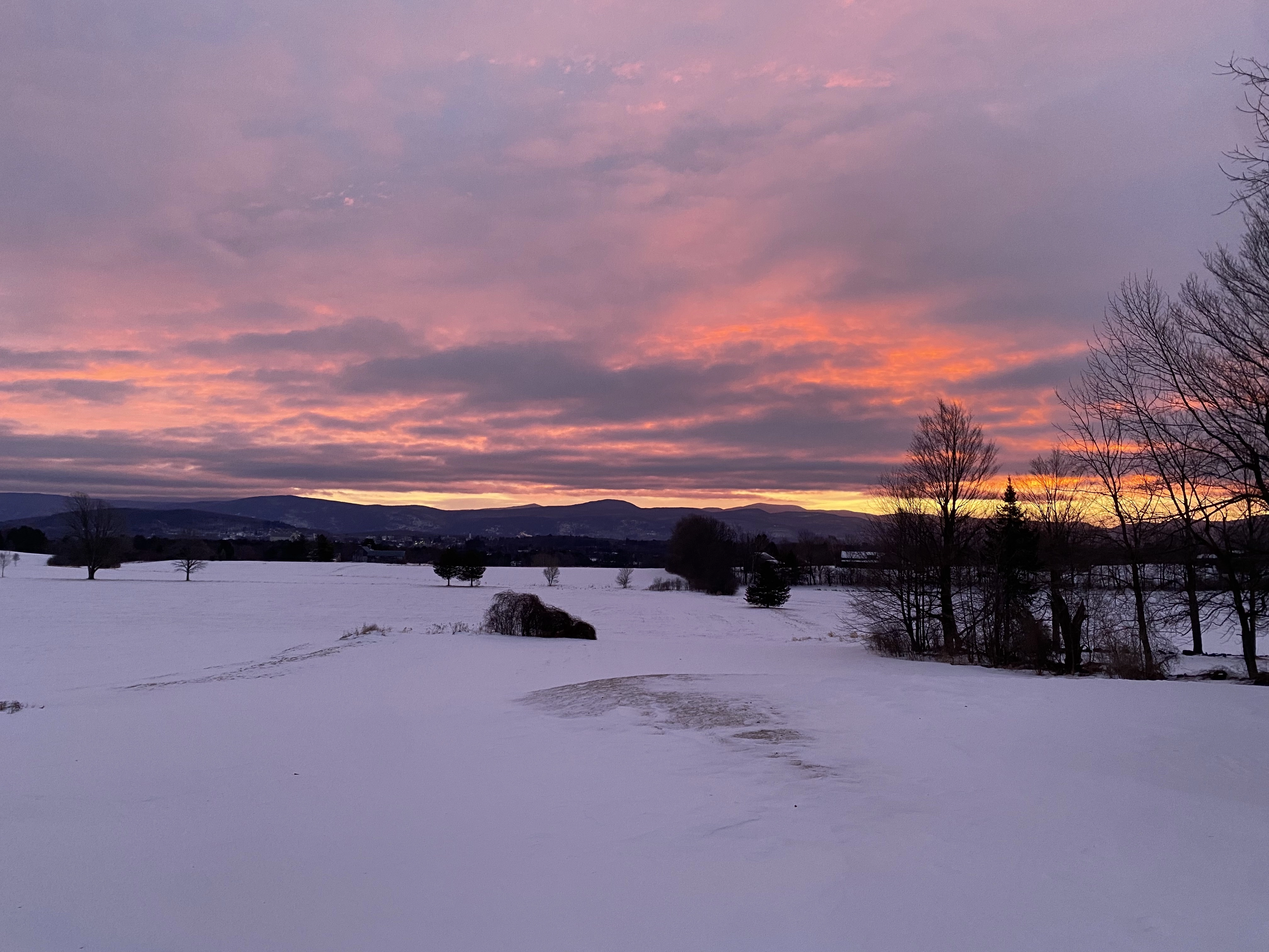
The Green Mountains in Fall and Winter (2023)
The Green Mountains evoke a sense of euphora. Their striking, panaramic vision amid various skyscapes through the seasons were ideal for goal of this packaging design.
I started by playing with color schemes using the original emblem to find a high contrast color group.

From there, I created a pattern that used color and negative space between congruent shapes to depict a fluid mountainous landscape.
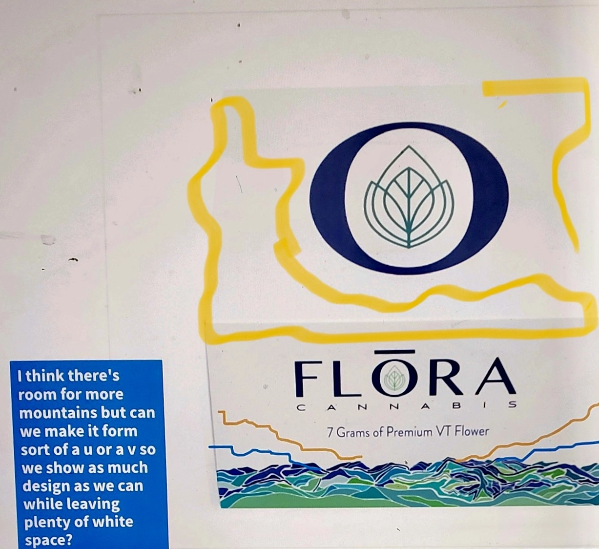
Example of collaboration process with owner after first edit feedback.
With more space to expand the pattern, I incoperated warm tones that serve to mimic a sunset effect and lift the eye towards the information that would later be inserted.
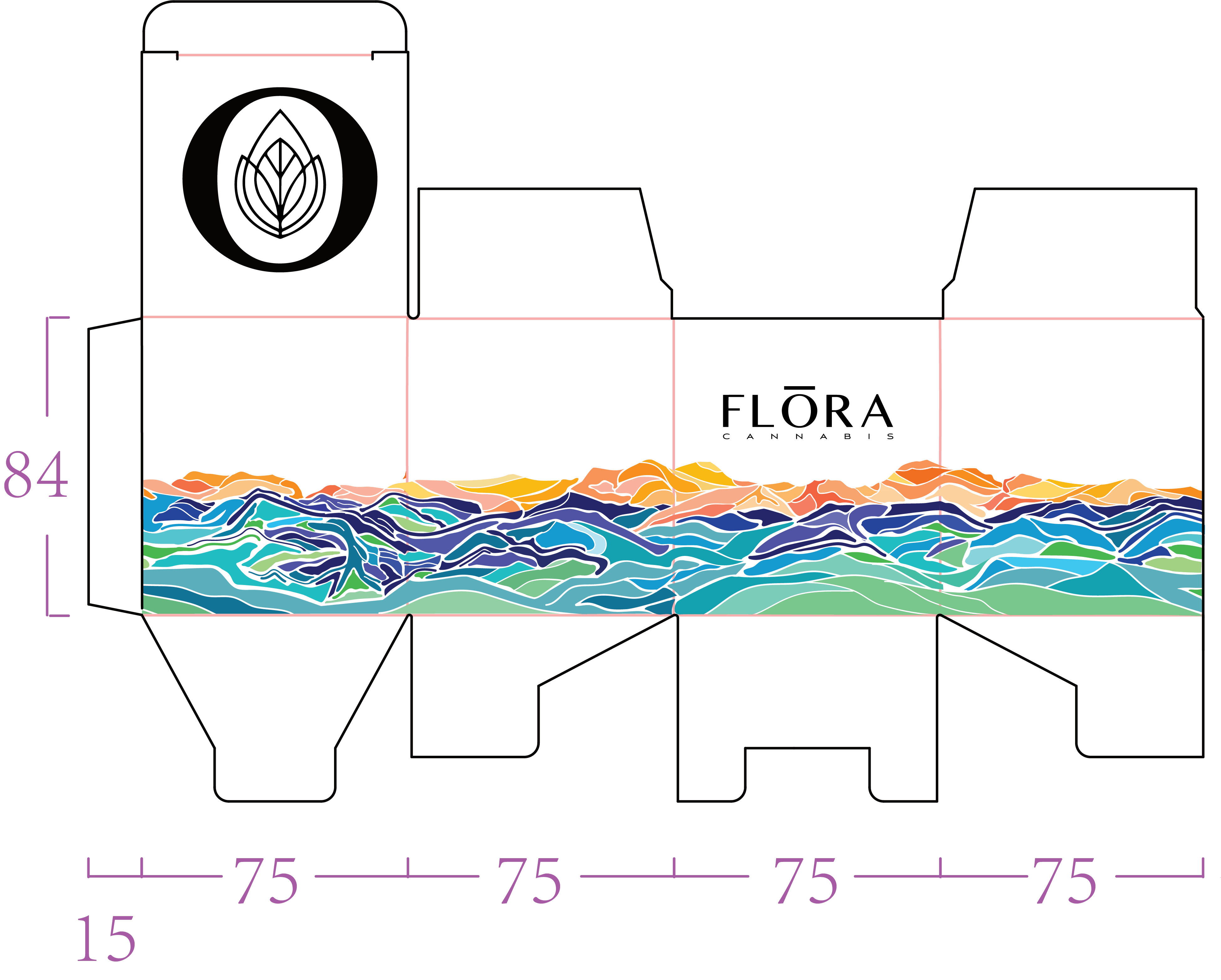
Artboard layout of 6oz box design.
Dieline template was provided by manufacturer.
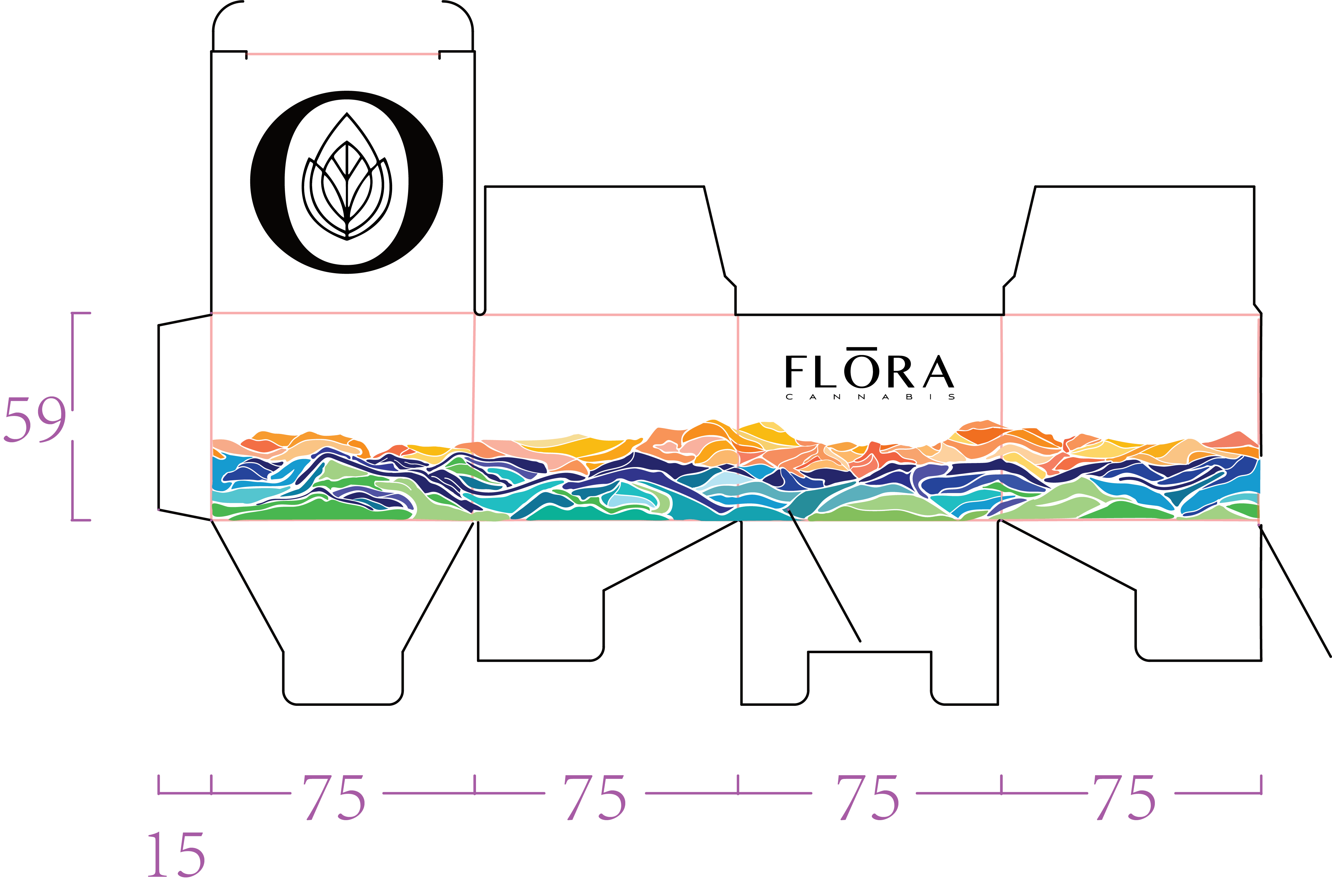
Artboard layout of 4oz box design.
FINAL PRODUCT
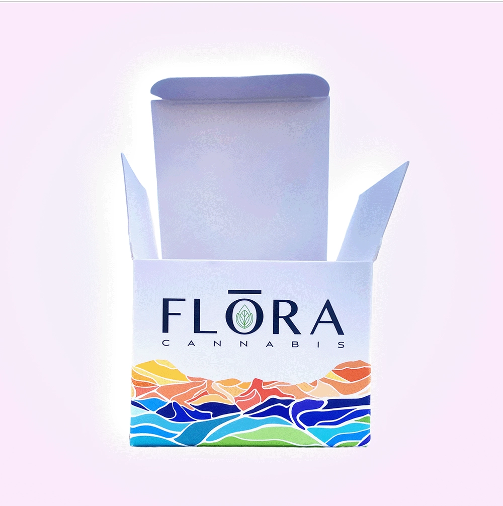
4oz box. Design element was printed matte with gloss logo and green accent on emblem.
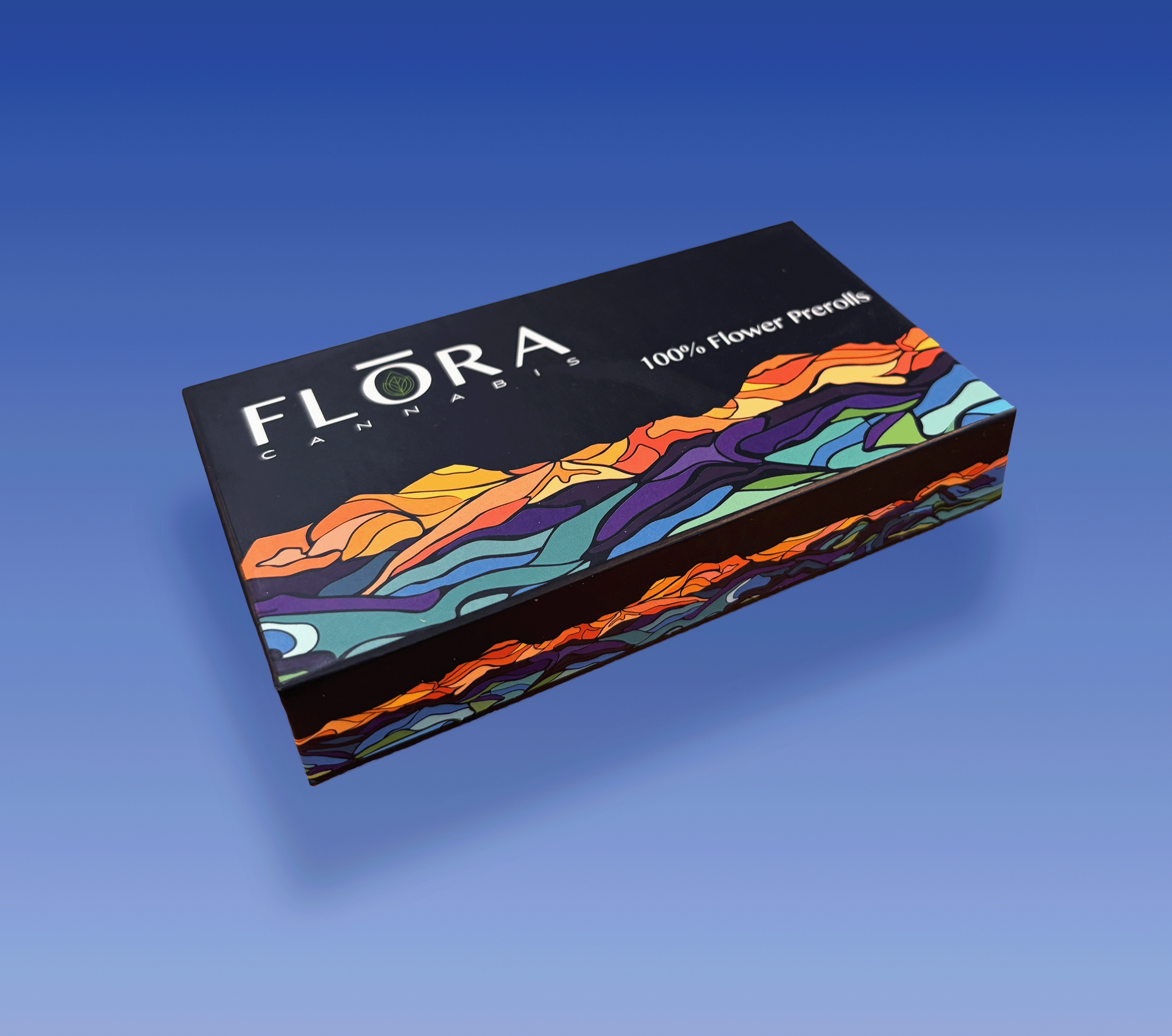
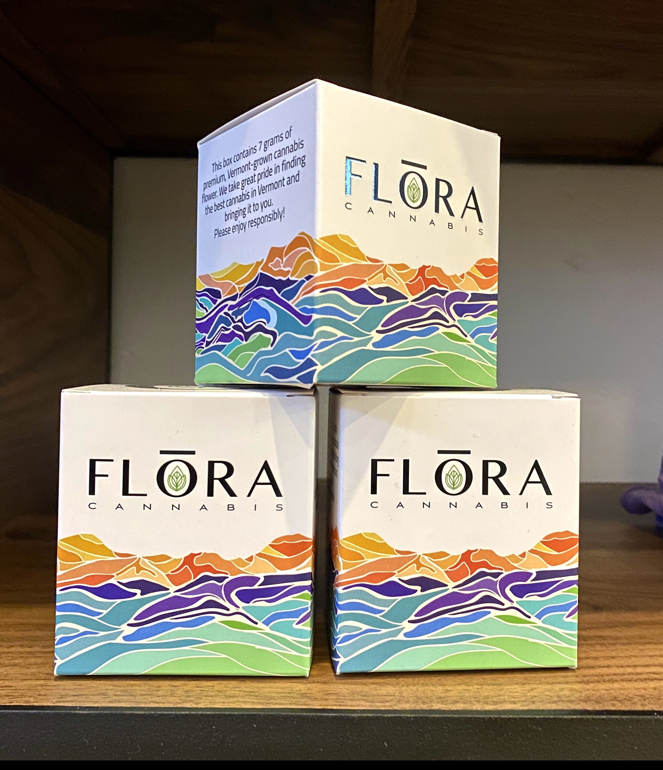
6oz boxes on shelves.
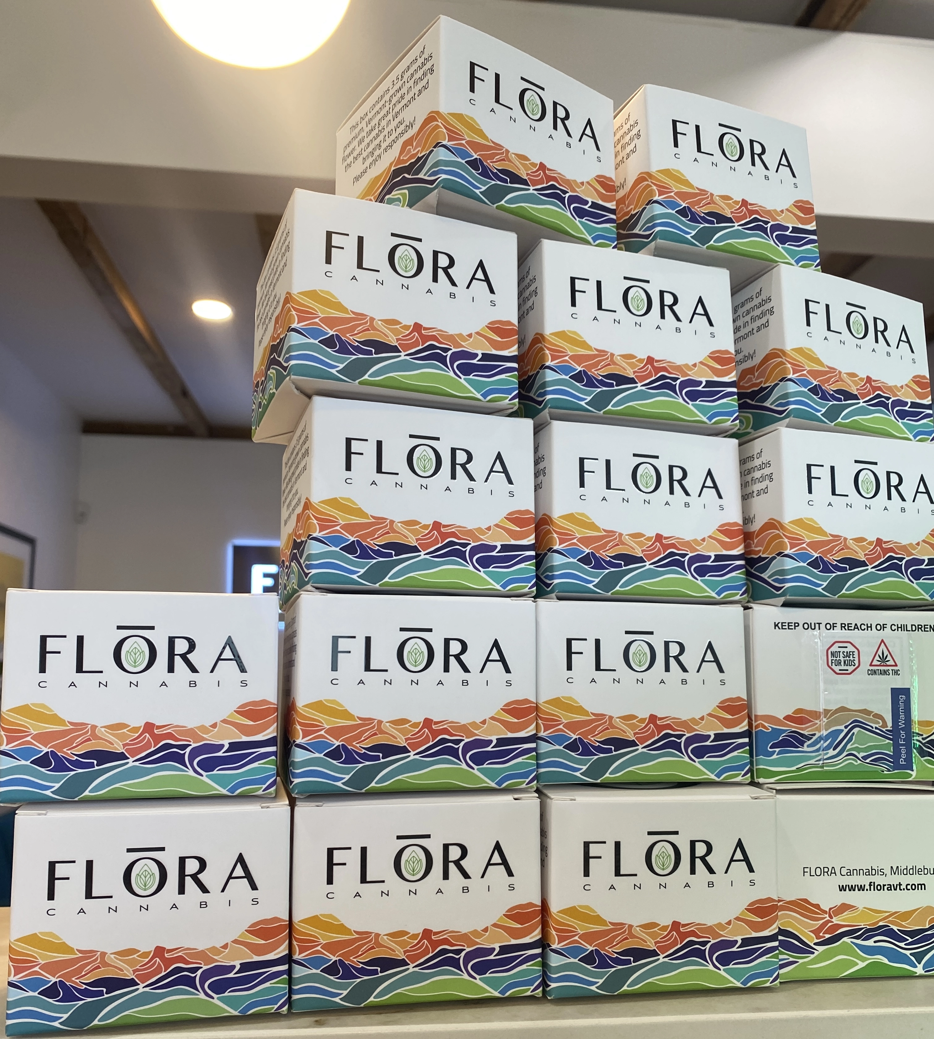
4oz boxes being folded and built.
SEE MORE
BRAND DEVELOPMENT

